Why Vertical App Drawers Just Make Sense
Quick Links
-
Your Apps, Fewer Swipes Required
-
You Can Skip to Apps by Alphabet
-
Vertical Scrolling Is Easier on My Thumb
-
This Approach Is Much More Intuitive
With One UI 7 hitting devices, millions of Samsung fans are being transitioned to a vertical app drawer for the first time, something other Android phones have had for decade. Why does this small change still strike so many as one of this update’s most exciting new features?
Your Apps, Fewer Swipes Required
We unlock our phones hundreds of times a day. We don’t access the app drawer each time, but that number probably isn’t much smaller. If a change can make our apps easier to access, the benefits of that change quickly add up over time. Making the app drawer vertical is such a change.
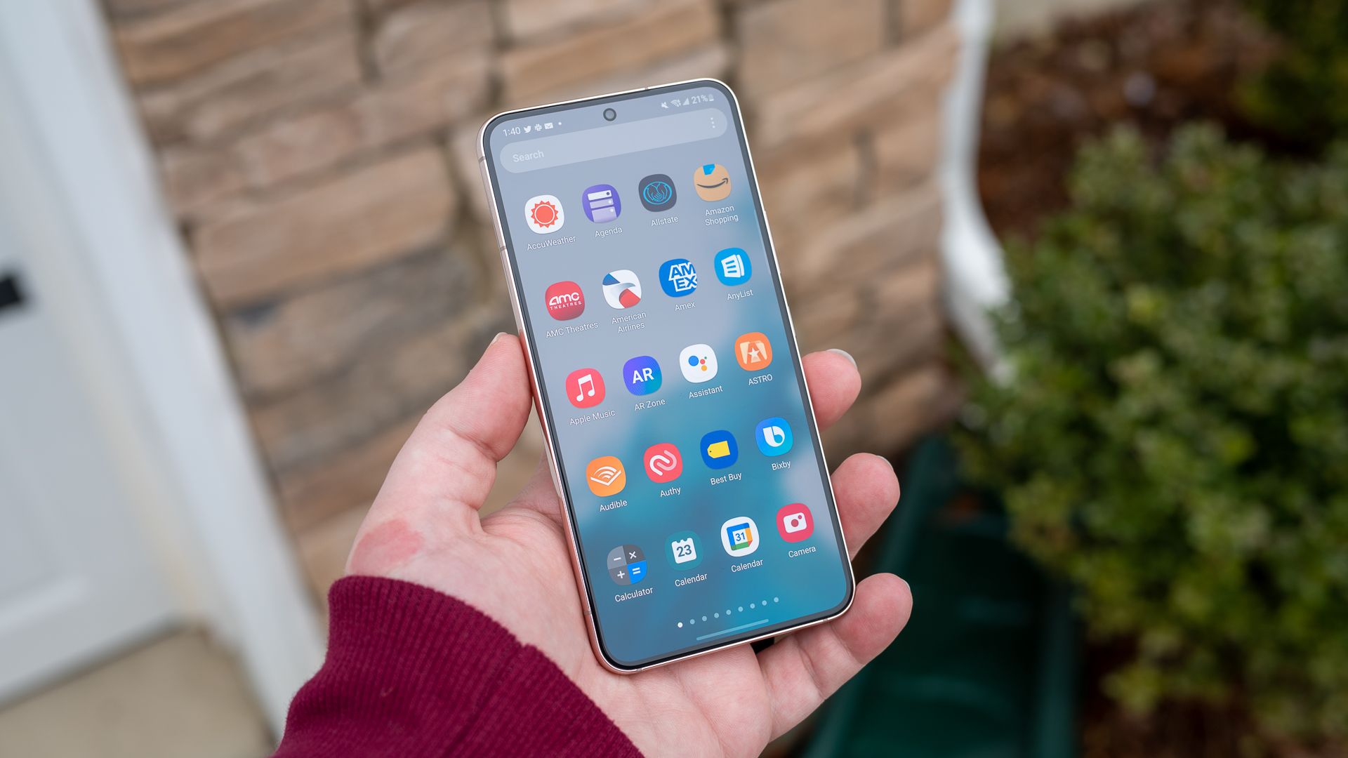
With horizontal pages of apps, it takes multiple swipes to access the majority of apps. The apps on the first page can be reached quickly. Each app on additional pages takes another swipe. The more apps you install, the longer it takes to reach the apps on the last page.
I personally found it very tedious to switch to the fourth page of apps and considered this reason enough to install an alternative launcher on Samsung phones. The phone in the photo below legit has nine pages of apps!
With a vertical app drawer, each app can be reached with just two swipes: one to open the app drawer and another to reach the right app.
That second swipe can be enough to quickly reach any app that I have installed. A short swipe keeps me towards the apps in the beginning of the alphabet. A quick, strong flick sends me towards the latter end of the alphabet.
What’s satisfying is that the motion has inertia. App icons scroll an equal measure to the speed of your swipe. After you’ve opened the app drawer a few times, you get a physical feel for how big a swipe is necessary to get to the app you want. It’s a sensation that feels satisfying in a way horizontal pages don’t.
You Can Skip to Apps by Alphabet
The speed of swiping is only part of the story. On some vertical app drawers, such as Samsung’s and that of my previous favorite—Niagara Launcher, I can quickly get to any app by browsing to its starting letter in the alphabet. You can do this by swiping slowly up or down along the side of the screen. When a letter of the alphabet appears, the app drawer app icons scroll to match each letter.
This shrinks the distance between apps that start with “h” and apps that start with “y.” One is no longer on the second page, while another is on the fourth. And rather than having to search icon by icon with my eyes, I can use the app’s name to speed things along.
Vertical Scrolling Is Easier on My Thumb
Personally, I find moving my thumb vertically much more comfortable than side to side. Don’t get me wrong, I don’t wince every time I swipe from this side of the screen to use the back gesture. But I do find the horizontal gesture uncomfortable when done often. This is part of the reason I usually don’t use horizontal swipes to change pages in eBooks and prefer to read by vertically scrolling those as well.
Related
Vertical Scrolling Makes eBooks As Addictive As Social Media
Want to read more books? Turn a weakness into a strength.
We could have started scrolling through horizontal websites decades ago, but we have chosen not to. Now that most of us browse the web by swiping vertically on phones, and this is the same way we navigate apps, we are all pretty well-trained. Why have the app drawer be the horizontal holdout in a vertical world?
This Approach Is Much More Intuitive
I appreciate when the flow of an interface helps guide me along. Consider how app windows expand out from their app icons when opened and shrink back down when closed. I like how the notifications and quick status drawers now appear with a blurred background in Samsung One UI 7, making it clear that they appear on top of your current app, but your app is still open. App animations can help what’s happening on-screen make sense.
But it’s not just the look of a vertical app drawer that’s easier to grok. It’s the behavior. You swipe up from the bottom to see the apps on your home screen, and then you continue swiping, using the same gesture, to see even more apps. Unlike horizontal pages, you do not need to change the motion of your thumb.
This one gesture is easy to memorize. No matter where you are, swipe up from the bottom to get to your apps. Whether that means returning to the home screen, opening the app drawer, or scrolling down to see the next set of apps.
Like many people, the addition of a vertical app drawer was one of the changes I was most excited to see in One UI 7. This one adjustment made it much more likely I was going to stick with Samsung’s launcher instead of an alternative. But this tweak wasn’t alone. There are many ways Samsung’s latest redesign has changed how I feel about default Android launchers.


